Replicon Software

Key Details

Project Type: Web Design, Print, Illustration, Branding

Timeframe: January 2018 - Present

Tools: Illustrator, Photoshop, XD, InDesign, WordPress

Collaborators: Design (Brenda Yee, Logan Evasco), Marketing (includes Product Marketing, Copywriting, SEO), Sales, Product, Web, and CEO

Outcomes: 10% more traffic in view demo pages after website redesign. United colors, font-styling, and iconography after website redesign. Marketing collateral more closely aligned with latest product UI. Email campaigns generate high engagement (boosts in homepage and demo page views) among mid-market businesses.

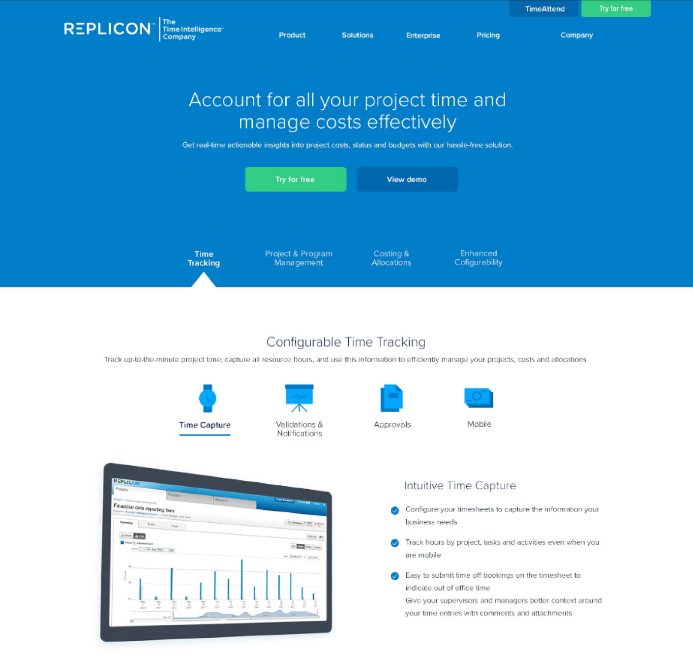
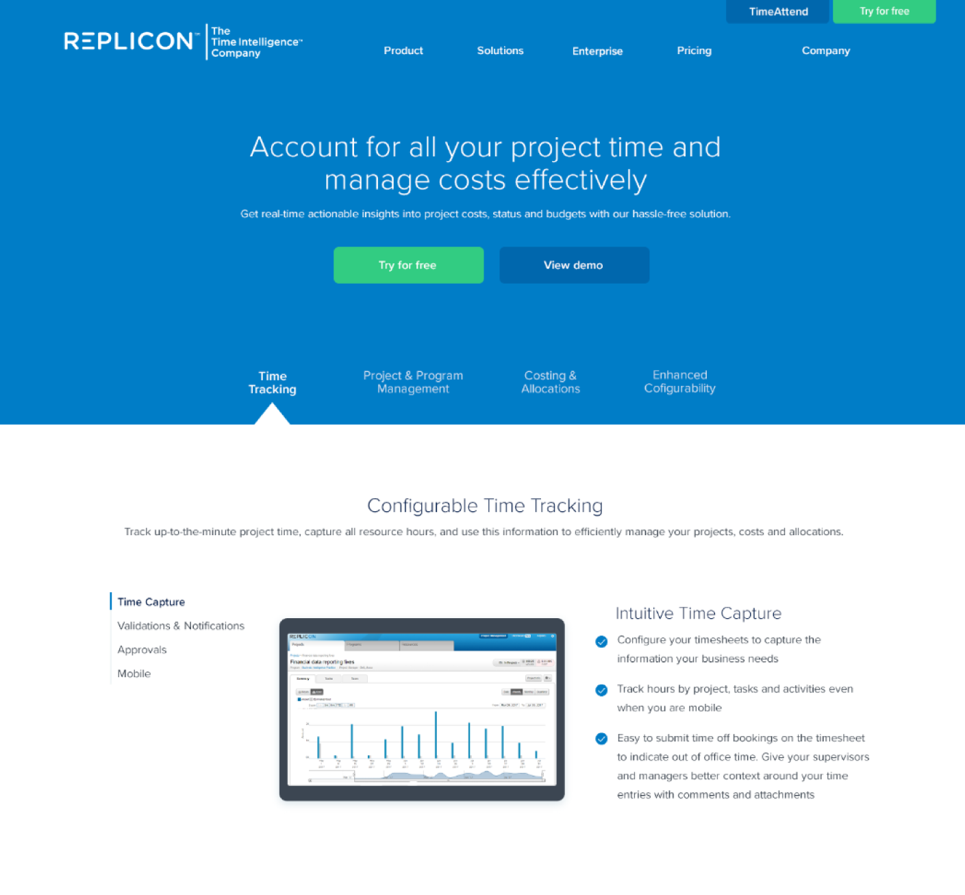
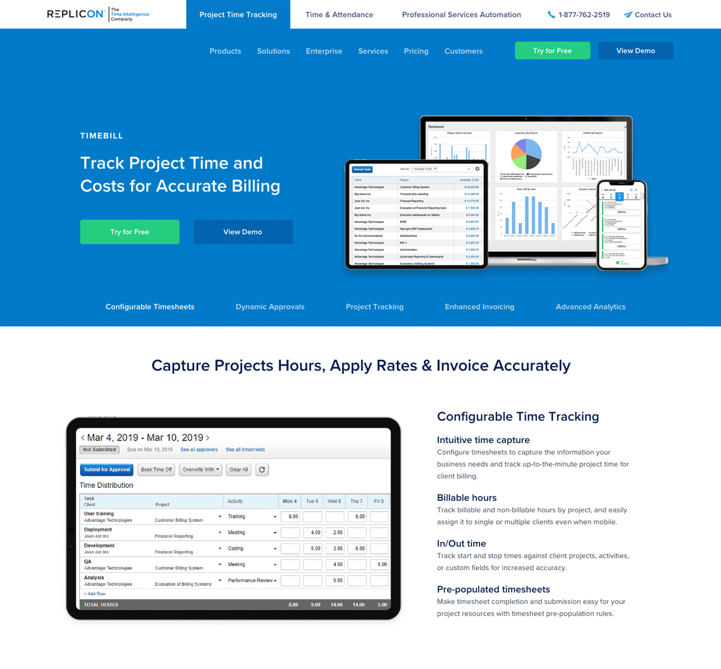
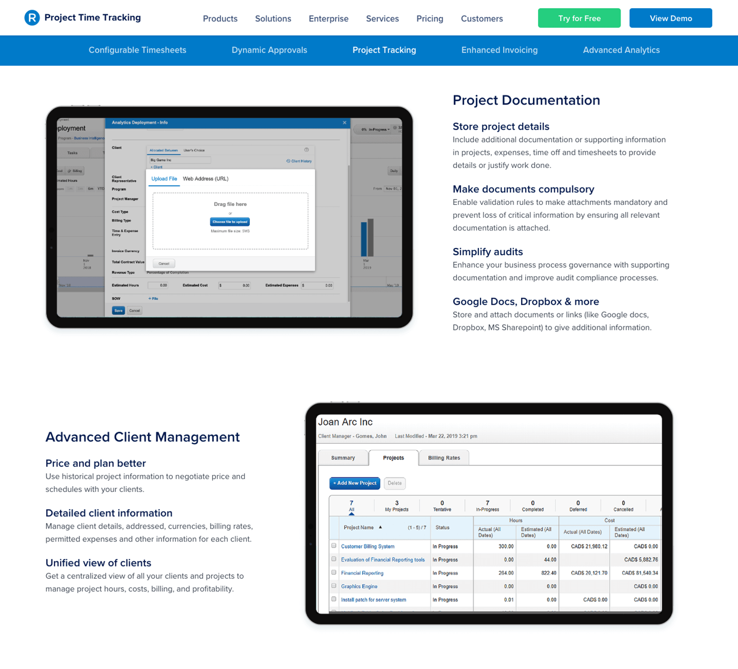
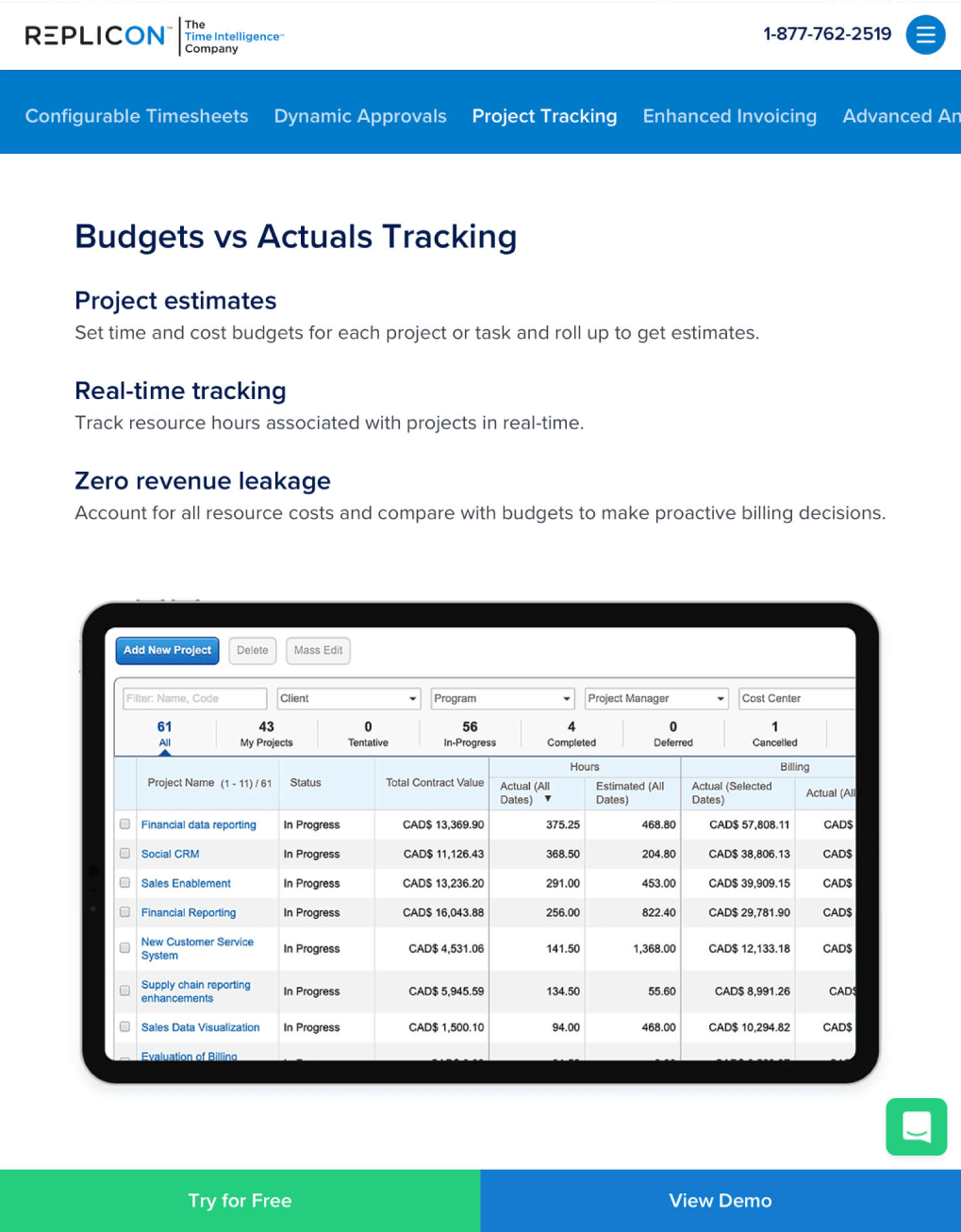
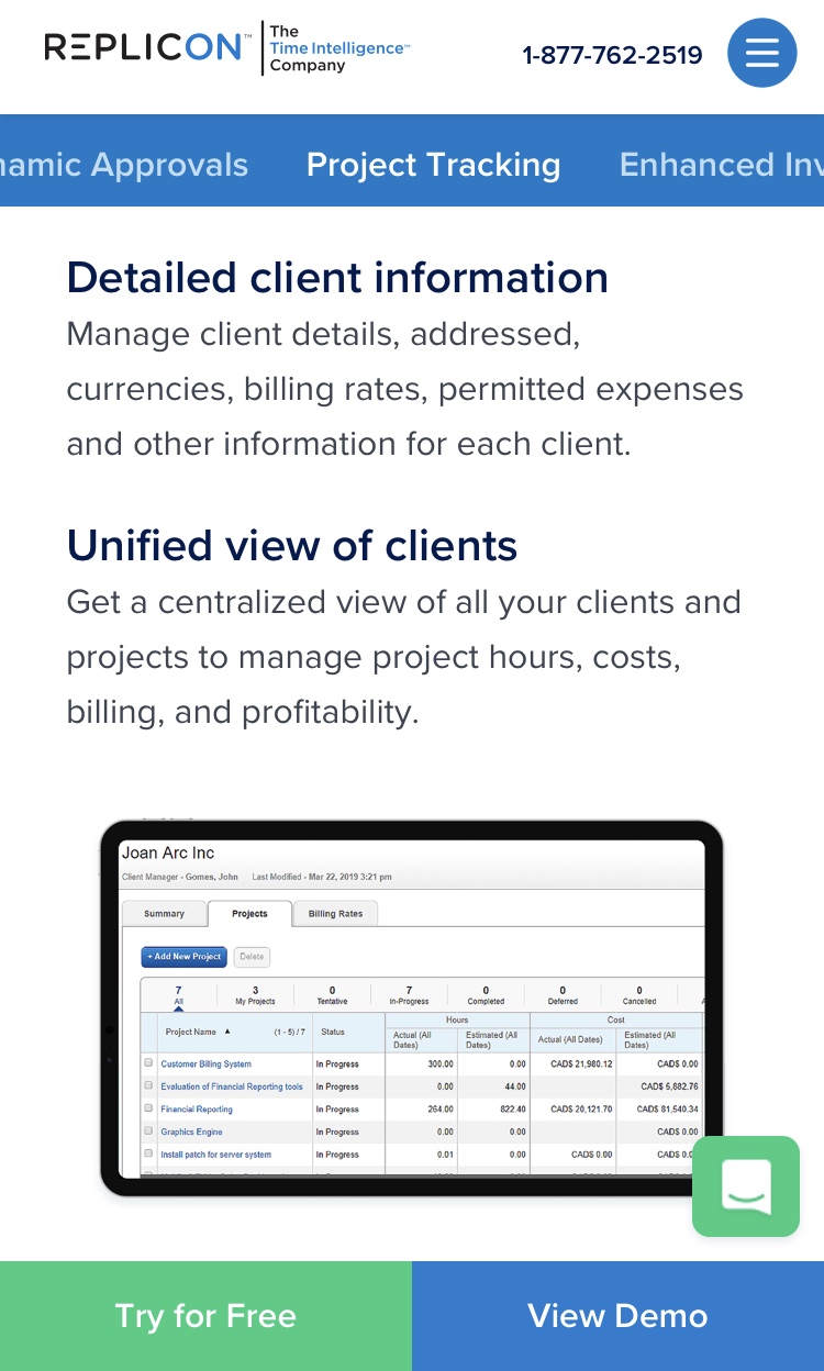
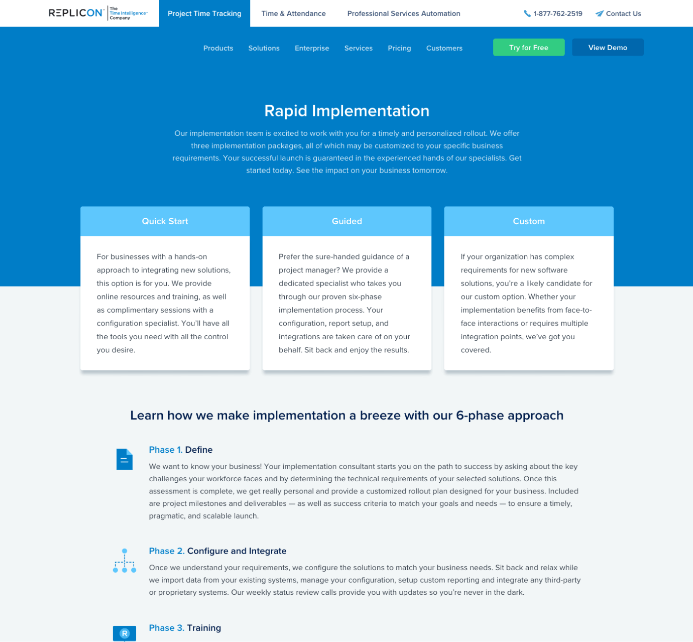
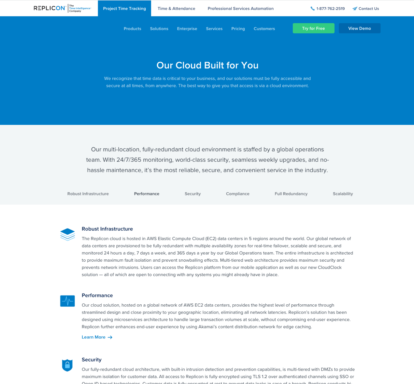
I currently work within a 2-person Design Team to revamp Replicon's visual design. Our work includes designing webpages and creating web banners, infographics, email templates, ebooks, slide decks, and print collateral (brochures, case studies, white papers, datasheets). We operate within the Marketing Team but we collaborate closely with the Webteam (based in Bangalore), oftentimes helping them update content on Replicon's WordPress-hosted website.

Revamped Style Guide

22-page 2019 Design & Brand Style Guide for Replicon
With over 450+ employees worldwide, maintaining a consistent brand identity can be a struggle. The 22-page 2019 Design & Brand Style Guide serves to help employees appropriately utilize the Replicon logo, fonts, colors and iconography.
Spread from 2019 Design & Brand Style Guide covering Replicon's primary and secondary colors
Spread from 2019 Design & Brand Style Guide - Color System. We stuck with solid and bold colors, doing away with heavily-used gradients and color overlays, to ensure that the revamped website and future collateral more closely aligned with the latest product UI from Replicon's Product Team.
Revamp concept of some of Replicon's product icons (TimeBill, TimeCost, Expense, TimeOff, TimeCore)
Product icon concept created during the early stages of the 2019 website revamp (from left: TimeBill, ProjectTime, Expense, TimeOff, Time & Attendance). Since Replicon offers 10 main products, using easily recognizable figures for icons can help viewers distinguish one product icon from the others.

2019 Website Revamp

Typical workflow process for website-related work
Workflow process for website tasks - Major collaborators include Project Marketing Manager, Copywriter, Webteam (front-end developers), and SEO Team
Early iteration of a product page header with product feature section
Early iteration of product page header layout with product feature section - In this iteration, there are main feature tabs at the bottom of the header that trigger feature details to appear when clicked. Clickable icons would further break down the features while also serving as a visual break from the extensive copy. Advantages: Page length is short. Complex layout comprised of bold icons and product screens is visually interesting. Disadvantage: High cognitive load for viewers due to complex layout of buttons. Poor representation of content hierarchy. Poor functionality since multiple clicking is necessary for viewers to get through the content. Tricky to implement for mobile.
Early iteration of a product page header with product feature section
Another early iteration of product page header layout with product feature section - In this iteration, there are main feature tabs at the bottom of the header that trigger feature details to appear when clicked. Feature details sections are laid out in 3 columns (from left: secondary navigation tabs in a vertical layout, product screen, and descriptive copy). Advantages: Page length is short. Complex layout is visually interesting. Disadvantage: High cognitive load for viewers due to complex layout of buttons. Poor representation of content hierarchy. Poor functionality since multiple clicking is necessary for viewers to get through the content. Tricky to implement for mobile.
Example of a product page hero section with tab links to enable quick navigation throughout the page
Final product page header layout with fixed tab links. This layout is both mobile-friendly and user-friendly, requiring a minimal amount of clicking. On all devices, users can either scroll through the page or quickly navigate to a particular section with the tab links
Product page body sections consist of large alternating left and right product screens with descriptive text. Large subheaders with smaller descriptive text further enable quick browsing and easy scrolling
Final product page body sections consist of large alternating left and right product screens with descriptive text. Although our product pages are content-heavy, large subheaders serve as focal points to reduce cognitive load, enabling quick browsing and easy scrolling through the page
Tablet View - Final product page body layout with fixed tab links
Tablet View
Mobile View - Final product page body layout with fixed tab links
Mobile View
Implementation page
Implementation page is a supplemental page for the purpose of walking potential customers through the product onboarding process. We made the page design simple and intuitive, pulling the types of approaches front and center as dominating elements. Onboarding phases appear below them in a simple step-by-step layout. Icons and bolded phase titles serve as focal points for better readability.
The Cloud Infrastructure page
Cloud Infrastructure page's primary purpose is to help the viewer navigate through Replicon's cloud environment. The content is dense, but the page was kept simple with tab links for quick navigation to descriptive sections (similar functionality as product page tab links). Icons serve as supportive and familiar visuals to represent the dense content.

Resource Webpages

Resource webpage
Our team wanted to create webpages out of our resources (eg. ebooks, whitepapers). This would enable viewers to access easily readable resources on any device. Viewers would still be able to download print versions through a button at the end of the webpage. In our templates, we added a table of contents section at the top to make it simple for viewers to quickly navigate to sections below.
Resource webpage body
In the body, section titles are the dominant elements. They are given the most visual weight through size and color. Section subtitles are focal points which make it easier for viewers to scan through the content. For these, we applied visual weight through size, weight, and color. When it comes to body text, we wanted to make it easily readable for viewers so we applied an appropriate font-size and line-height. To further facilitate readablility, we also placed imagery or pull-out quotes in between some paragraphs to give viewers breathing room when reading through the text.
Tablet View - Resource webpage body
Tablet View
Mobile View - Resource webpage body
Mobile View

Web Banners

Digital ad for the purpose of recruiting engineers
Digital ad created for our Recruitment Manager in Calgary
Digital ad for the purpose of recruiting engineers
Creative customer quote banner concept for blog and social media

Marketing Emails

Fall-themed illustration and email template design for prospective customers
Fall-themed illustration and email template for prospective customers. Messaging was crafted by our copywriter
Holiday-themed illustration and email template design for prospective customers
Holiday-themed illustration and email template for prospective customers. Messaging was crafted by our copywriter